The Helicon mark symbolises a fictional planet from the Foundation Universe by Isaac Asimov. In the novels Helicon is the home planet of Hari Seldon, the man behind a statistical theory that predicts the future of humanity.
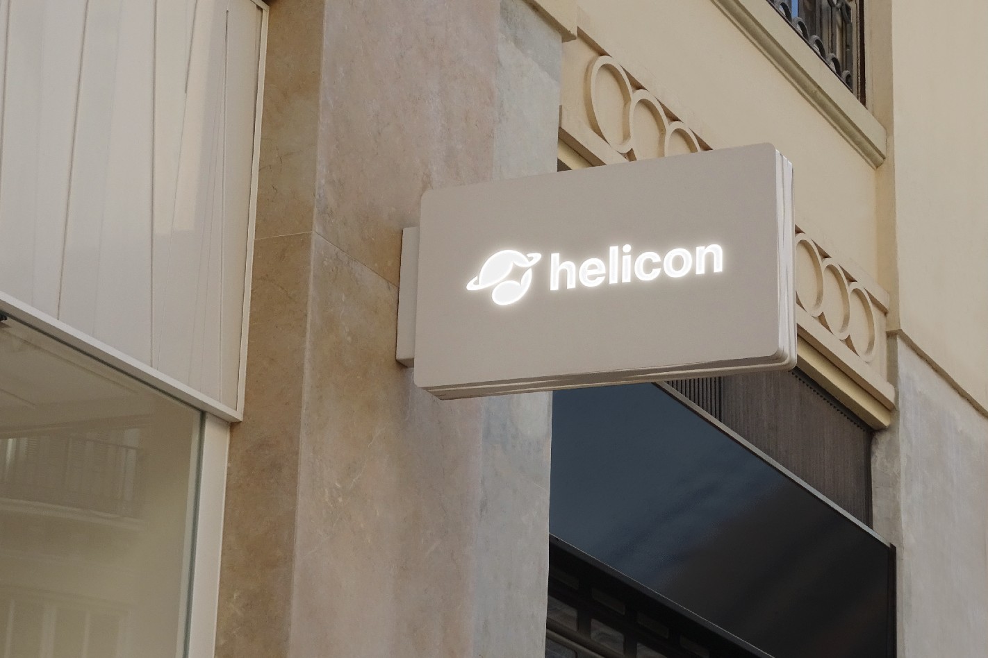
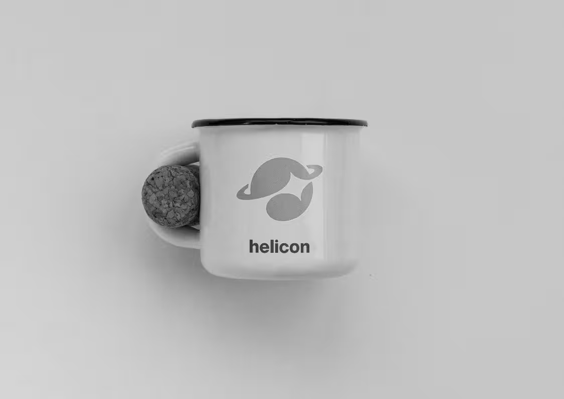
Our mark can be used without the wordmark in places where spelling out the company name is superfluous. It is ideal for use as an avatar on social media sites, for example.


We follow a mostly monochrome design approach, where color is used with intention rather than decoration. Our core UI and branding elements are built on a refined grayscale palette, creating a neutral, professional, and timeless foundation. When color is introduced, it carries meaning.
The colors were selected to represent the surface of the planet and the galaxy to which it belongs.
Less vibrant versions of the brand colors can be used when less contrast is needed.
Softer versions of the primary colors used in backgrounds and similar contexts.
Our core UI and branding elements rely on a refined grayscale palette, creating a neutral, professional, and timeless foundation.
You can blend brand colors when using them in graphics or ui elements such as buttons and icons. We recommended that you use colors that are close in value and hue for best on-brand effect.
Our primary brand font is called Inter. It is a modern, highly legible sans-serif typeface designed for both digital and print. Inter provides clarity and versatility across all sizes and weights.
Titles are usually set in semibold (sometimes bold), with slightly reduced letter-spacing to give them a more modern feel.
Inter can be substituted with Arial when not available.

Our brand icons come from Remix Icon. This open-source icon set is clean, modern, and highly legible at all sizes. The consistent stroke style and balanced proportions ensure clarity across digital and print applications.