In many organizations, hundreds of assets are constantly publishing operational data (temperatures, pressures, flow rates, statuses, energy readings) into a system that was never designed to answer questions. The data arrives, gets stored, and sits there. Millions of readings accumulate year after year, locked inside a platform built to collect data rather than to surface insight from it.
District heating is one domain where we have solved this problem, but it isn’t specific to district heating. Any operator running a large fleet of distributed physical assets might miss out on value that can’t be realized because the data simply isn’t available.
In this post, I will show you how I took one such dataset and turned it into a scrubbable, geospatially aware, user-friendly monitoring platform using TimescaleDB and Grafana. Two popular tools, both well-maintained, well-documented, and really good at their respective jobs. The domain here is district heating, but the approach applies anywhere you have assets, sensors, and data that isn’t being fully used.
The dataset
I found a really interesting dataset for this case. The PreDist dataset, published by Enercity AG. It contains real operational time-series data from 93 district heating substations across two manufacturers, along with labeled fault reports and maintenance logs.
The data resolution ranges from 1 to 10 minutes. It contains readings from temperatures, flow rates, valve positions, pump statuses, and energy readings, among others. Across all 93 substations and 49 distinct metric types, the total row count is about 12 million.
In a production setting, this data would arrive as a continuous stream using AMQP or MQTT from controllers, OPC UA from SCADA, or a message bus sitting between edge devices and the database. The ingestion pipeline matters, but it’s not the topic of this post. This post covers what happens once the data lands.
TimescaleDB's continuous aggregates
Raw data is great for forensics, but querying raw data directly for routine monitoring is often inefficient and time-consuming. Building a UI that depends solely on raw table scans leads to slow page loads and a poor user experience.
TimescaleDB’s continuous aggregates address this. At scheduled intervals, TimescaleDB continuously aggregates the raw data and stores it in materialized views. For this case, I’ve chosen to aggregate the raw data (1- to 10-minute resolution) into hourly buckets. Those hourly buckets are then in turn aggregated into daily buckets. This makes the aggregates hierarchical, which speeds up the aggregation process since the raw data only needs to be read once, by the hourly aggregate.
Grafana
Since TimescaleDB is just PostgreSQL under the hood, I didn’t need to learn a vendor-specific query builder to use it in Grafana. I just write SELECT statements. Two TimescaleDB macros, $__timeFilter() and time_bucket() , handle the time-window and bucketing logic that would otherwise mean string-concatenating dates by hand in the panel editor. The dashboards and datasources live as JSON files in the same git repo as the schema, so a panel change shows up as a diff I can review, not a screenshot pasted into a Slack thread.
I created a read-only PostgreSQL role that Grafana uses for its queries. That way an SQL query from Grafana can never modify the data, enforcing least-privilege access even for internal tools.
Grid map dashboard: a geographical overview
The Grid Map dashboard is designed for macro-level monitoring, giving a network operator an immediate visual check of system status.
A geomap panel plots all 93 substations as colored markers on a dark basemap. The color represents the selected metric’s value: averaged, min’d, max’d, or first/last, over the current time window. Blue is cold, red is hot, and a continuous-BlYlRd scale handles everything in between.
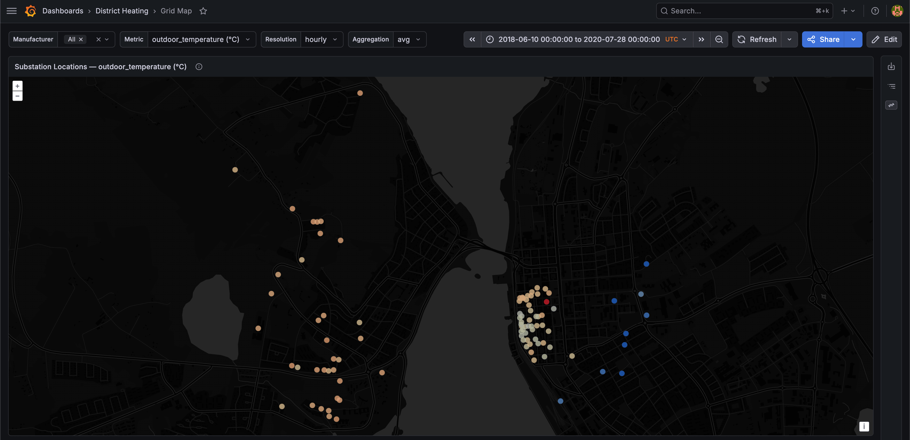
Using Grafana's shortcut buttons to travel forward and backward in time turns a static map into a timelapse of the network's thermal state.

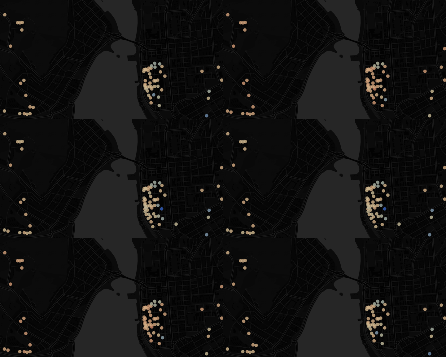
The queries only hit the continuous aggregates. A query that aggregates across all 93 substations over a month of daily data touches roughly 120,000 rows instead of tens of millions. The panel responds in milliseconds.
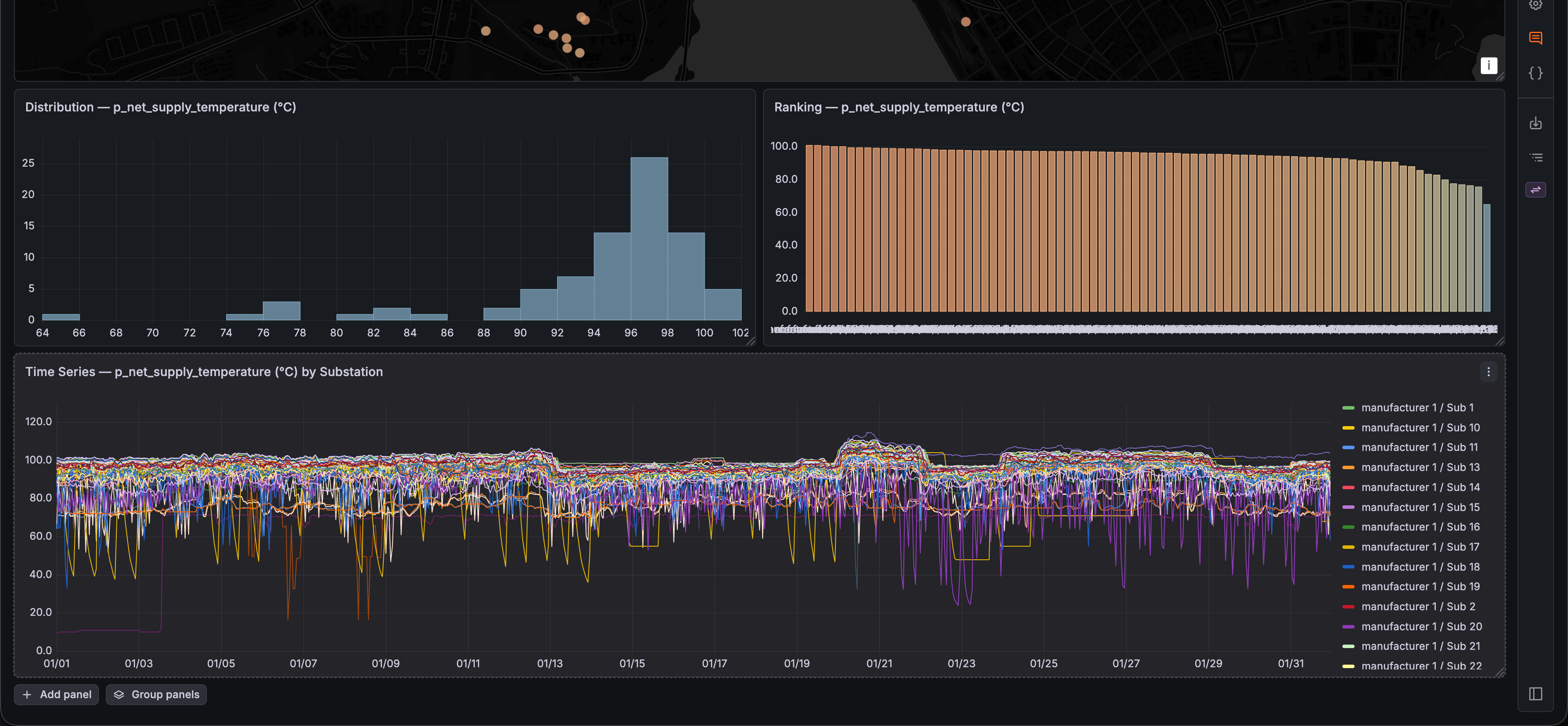
Below the map, I added bar chart panels for distribution and ranking, along with a general line chart panel that plots the selected metric from all substations. This provides more insight into outliers than the map alone.
Note on the map markers: The original dataset contains no geographical data. I synthesized coordinates by looking at outdoor temperature and supply temperature. Substations with similar values at the same timestamps cluster together. The resulting coordinates are then snapped to real OpenStreetMap building footprints in Östersund, so the markers sit directly on real structures on the map.
Substation Explorer Dashboard: the deep dive
The Explorer dashboard provides panels structured for analyzing the different parts of a district heating system.
Select a manufacturer, pick a substation, and you get a full diagnostic layout:
- Network Supply & Return : Plots primary-side temperatures and flow on dual Y-axes.

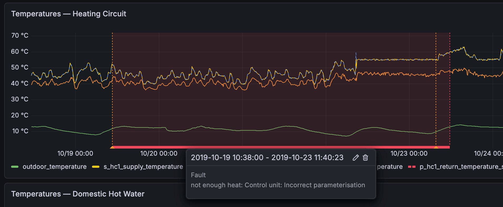
- Heating Circuit Temperatures : Plots secondary-side temperatures, with setpoints rendered as dashed lines.

- Domestic Hot Water Temperatures : Plots DHW temperatures, storage upper/lower, and setpoints.

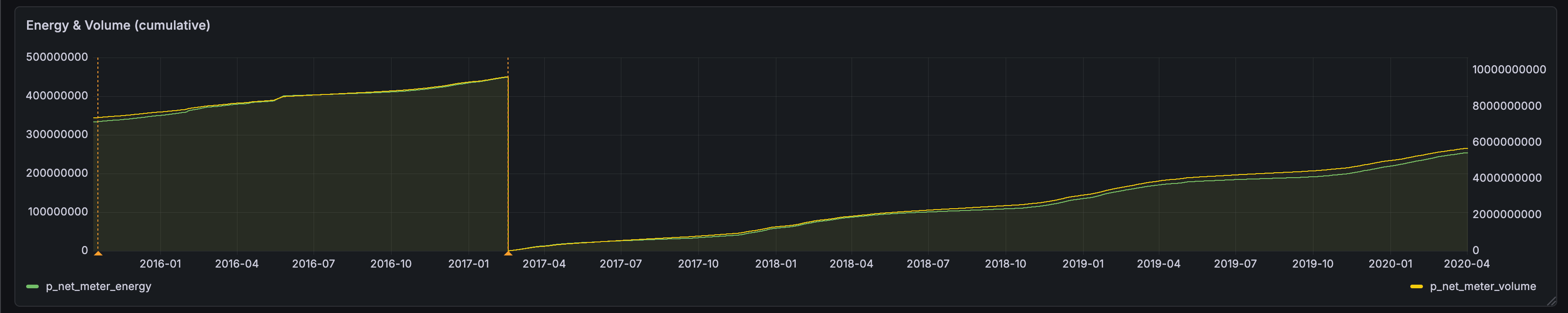
- Energy & Volume : Plots cumulative meter readings over time.
- Fault History : A table of all recorded faults for the selected substation, with dates, problem categories, fault labels, and monitoring potential scores.

By using Grafana’s native annotations, fault and disturbance events are nicely overlaid on every time-series panel. Red regions mark fault periods, from report date through to anomaly end, and orange markers flag maintenance events. This makes it possible to visually correlate a temperature anomaly with a known incident.
Takeaways
I believe many companies have large volumes of operational data used for only a fraction of the value it could provide, sitting in static systems that can't adapt as the world around them does. The instinct might be that, to be more dynamic and modern, you should match the scale of the data with equally scaled infrastructure: data lakes, stream processing frameworks, dedicated analytics clusters, or expensive SaaS platform contracts. Sometimes that’s warranted.
But as an initial step toward a more insightful, data-driven system, the solution is much simpler.
TimescaleDB turns PostgreSQL into a time-series database without abandoning what makes PostgreSQL useful: SQL, joins, indexes, transactions, roles, and an ecosystem of tools that already know how to talk to it. Continuous aggregates handle performance declaratively. The database does the work so you don’t have to build a pipeline to do it. Whether the data comes from heating substations, production lines, HVAC controllers, or water pumps, the pattern is the same.
Grafana lets you use SQL to build something useful. Every panel on both dashboards (the geomap, the histograms, the fault table) comes from a query, with no separate charting library or frontend framework involved. Variables, annotations, and provisioned data sources are just more SQL and JSON sitting next to the schema, so a dashboard change is as easy to review as a change to a table definition.
Together, these two tools turned 12 million rows of raw sensor data into something browsable, using two dedicated tools, a schema that respects the data’s shape, and a few well-placed materialized views.
